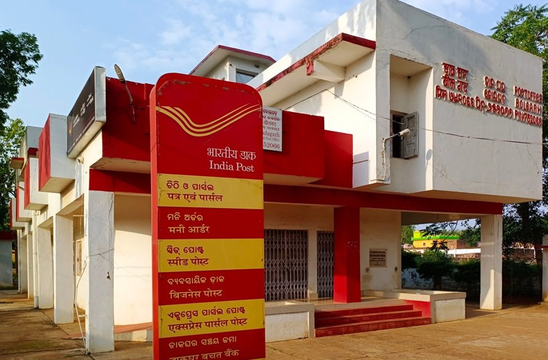
Indian Postal Service - Website Redesign
India Post is a government-operated postal system. It was founded in 1854. Generally called “The Post Office” in India, its is the most widely distributed postal System in the world.
UI/UX Design Case Study
Client
Self Project
My Role
UI/UX Designer

Overview


155,015
Number of Post Offices in India
8,511
On an average, people are served by a Post Office in the country
20.99 sq.km
Average area served by a Post Office
My Design Process
Here is the standard UX design process that I followed. It is a continuous process that includes research, prototyping, testing, and refining.


Discover
Identifying Problem
Secondary Research
Competitive Analysis
Define
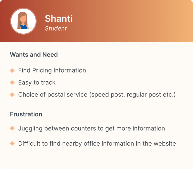
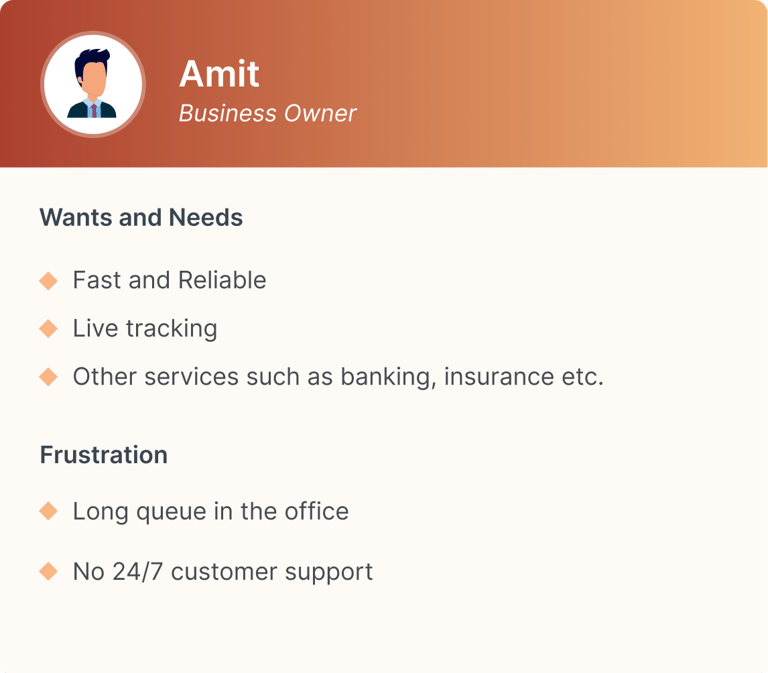
Personas
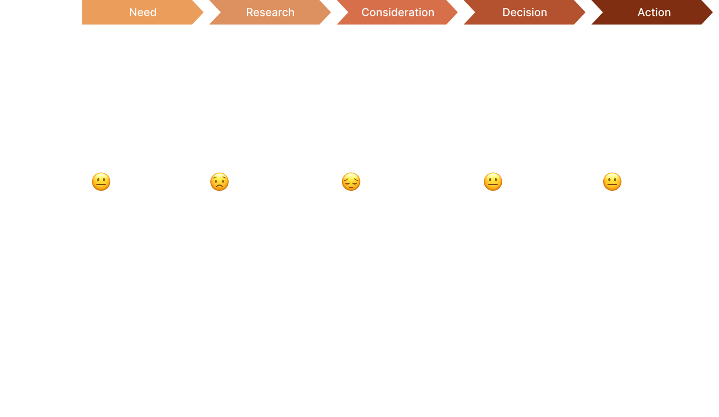
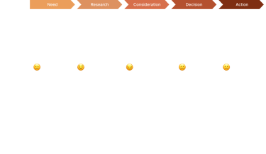
User Journey Map
Ideate
User flow
Wireframing
Design
Style Guide
Visual Design
Prototyping
Test
Usability Test
Gather Feedback
Identifying the Problem
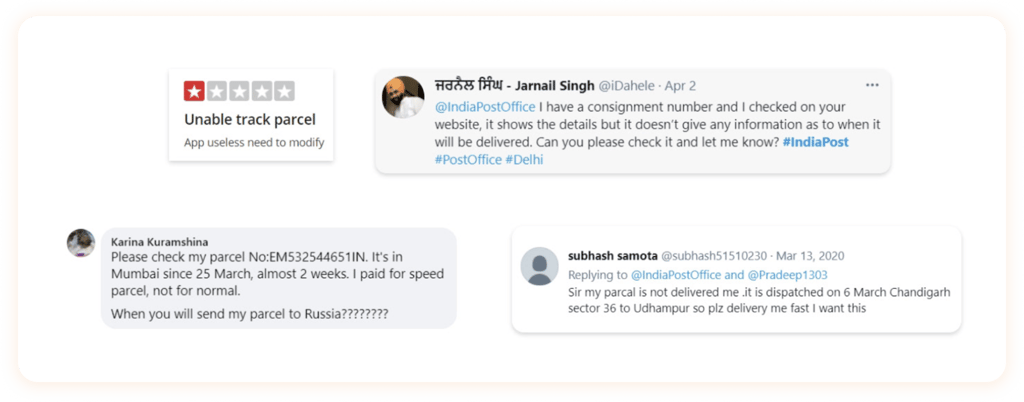
Despite having one of the oldest and widest networks of India, people are not satisfied with the service of India post as it has partially failed to deliver and meet the needs of the time.
Below are a few instances from various social media sites.

Competitive Analysis
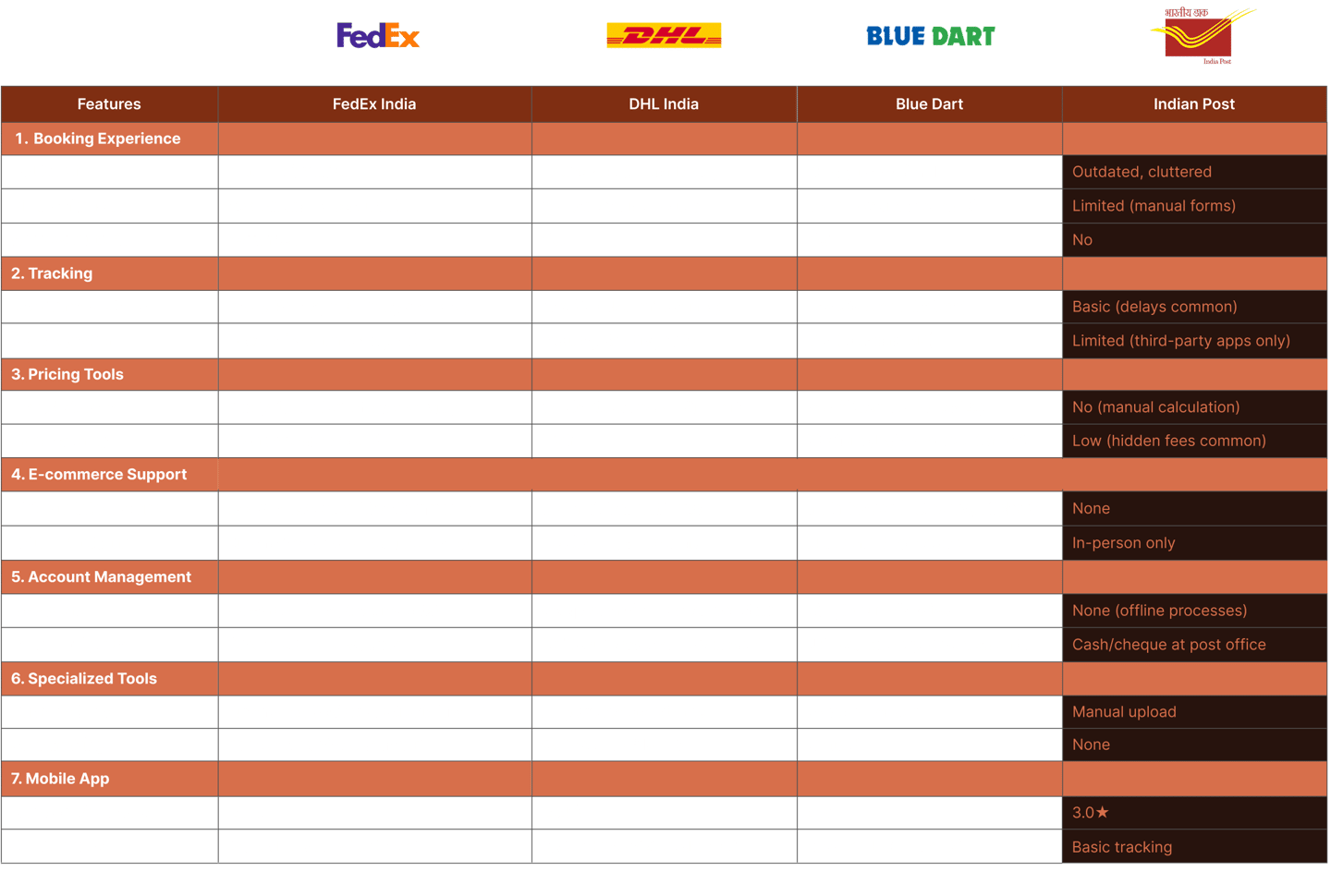
Key Differences Between These Companies
Simple and easy to use website
Accurate trace and track service
24/7 Customer support
Reliability and trust gained over the years
Summary
Customer expects for a smooth and reliable service provider, which provides faster deliveries, trackable, better shipping rate and good customer service.



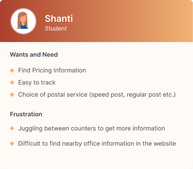
User Persona
Capturing the needs, motivations and frustrations of the Users

User Journey Map
Scenario : User want to mail a letter using postal service

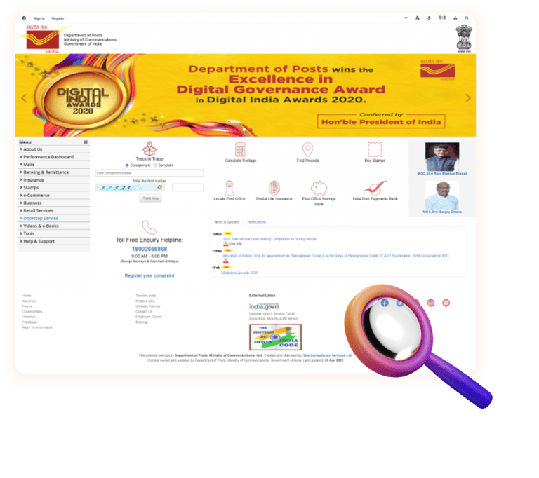
Diving Deep into India Post website
Observations
Poor information hierarchy
Over crowded design
Navigation is not user-friendly
Improper uses of image, icons, colors and type scale
Most demanding feature in the website are
Track and Trace
Pricing
Locate Post Office
Refining the brand elements and interfaces
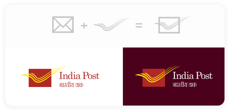

Refining the logo
The logo is not proportionate. The text size is very small compared to the wide logo background. This makes the text illegible on scaling down the logo size.
Adjusted the aspect ratio of the envelope with the wing. Enlarged the text and moved the text to the right to make it legible. The intent here is to make the logo fit correctly in every medium without losing its originality.
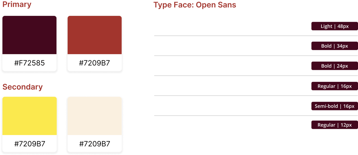
Color and Typography
Defining the style guide

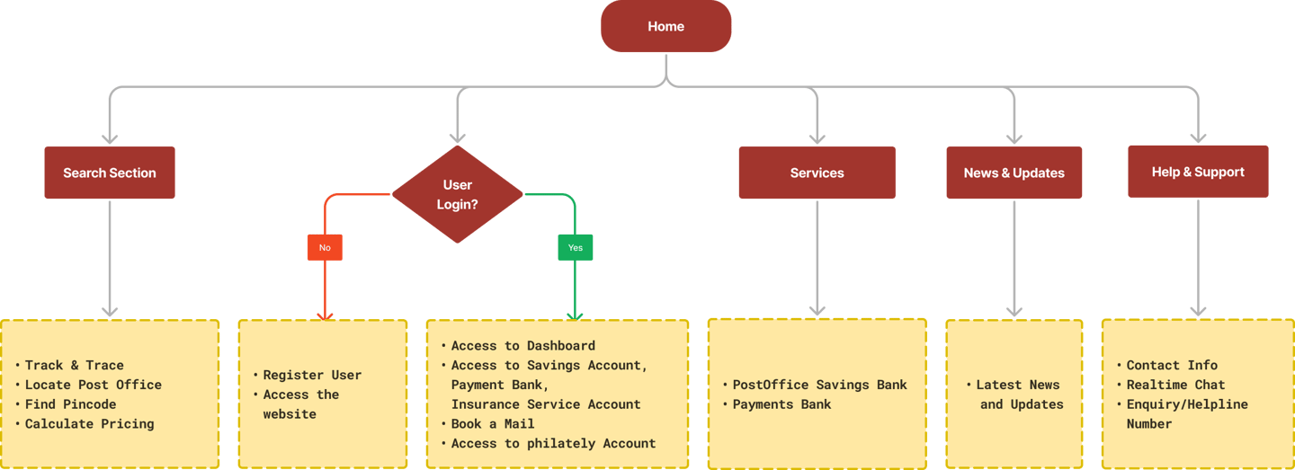
User Flow
User flow diagram for the landing page of the Website
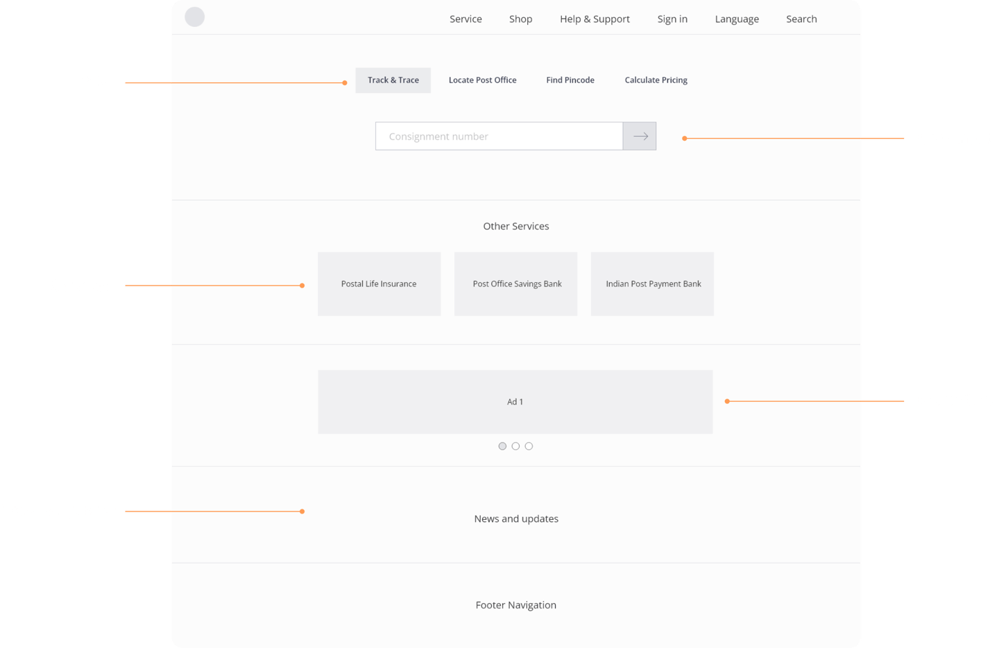
Wireframe
initial wireframe for the idea

Interface Designs
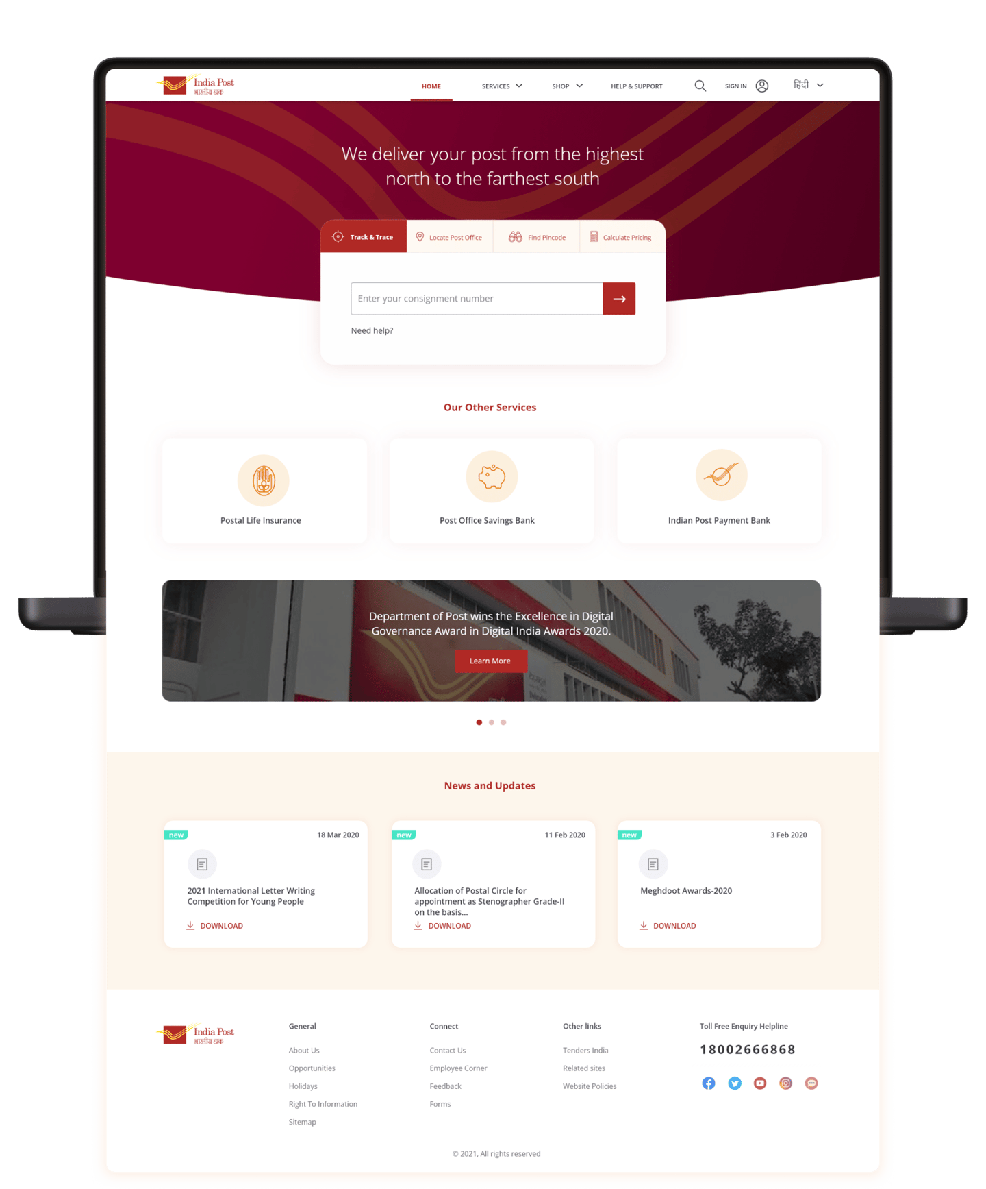
High Fidelity UI mockup


Marketing/Social Post Designs
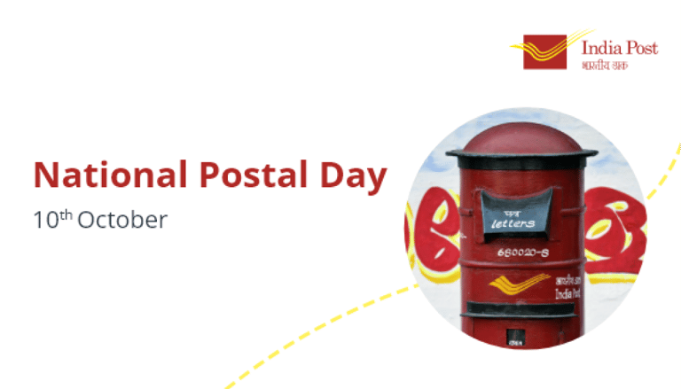
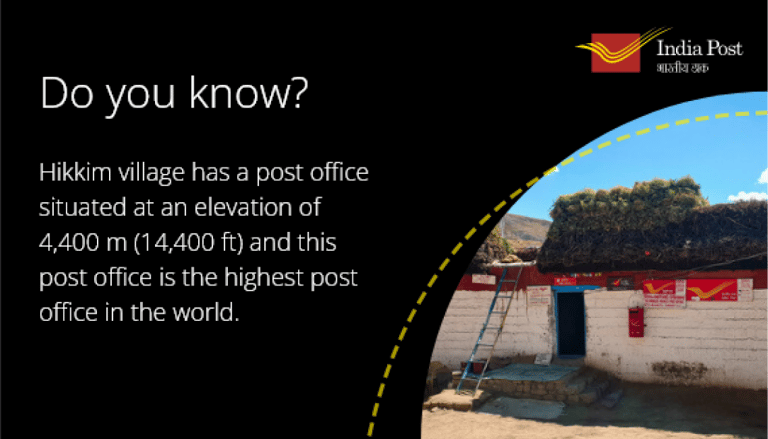
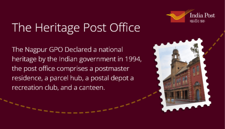
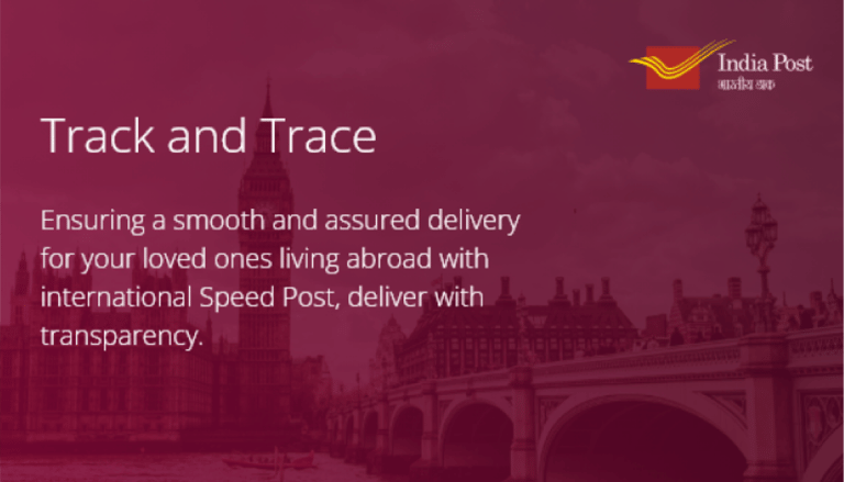
Defining a style to promote the India postal service in a consistent design language
